- Release notes
- Getting started
- Installation
- Configuration
- Integrations
- Authentication
- Working with Apps and Discovery Accelerators
- AppOne menus and dashboards
- AppOne setup
- TemplateOne 1.0.0 menus and dashboards
- TemplateOne 1.0.0 setup
- TemplateOne menus and dashboards
- TemplateOne 2021.4.0 setup
- Purchase to Pay Discovery Accelerator menus and dashboards
- Purchase to Pay Discovery Accelerator Setup
- Order to Cash Discovery Accelerator menus and dashboards
- Order to Cash Discovery Accelerator Setup
- Basic Connector for AppOne
- SAP Connectors
- Introduction to SAP Connector
- SAP input
- Checking the data in the SAP Connector
- Adding process specific tags to the SAP Connector for AppOne
- Adding process specific Due dates to the SAP Connector for AppOne
- Adding automation estimates to the SAP Connector for AppOne
- Adding attributes to the SAP Connector for AppOne
- Adding activities to the SAP Connector for AppOne
- Adding entities to the SAP Connector for AppOne
- SAP Order to Cash Connector for AppOne
- SAP Purchase to Pay Connector for AppOne
- SAP Connector for Purchase to Pay Discovery Accelerator
- SAP Connector for Order-to-Cash Discovery Accelerator
- Superadmin
- Dashboards and charts
- Bar charts
- History charts
- Distribution charts
- HTML panels
- Migrating legacy charts to new charts
- Tables and table items
- Application integrity
- How to ....
- Working with SQL connectors
- Introduction to SQL connectors
- Setting up a SQL connector
- CData Sync extractions
- Running a SQL connector
- Editing transformations
- Releasing a SQL Connector
- Scheduling data extraction
- Structure of transformations
- Using SQL connectors for released apps
- Generating a cache with scripts
- Setting up a local test environment
- Separate development and production environments
- Useful resources

Process Mining user guide
Distribution charts
Introduction
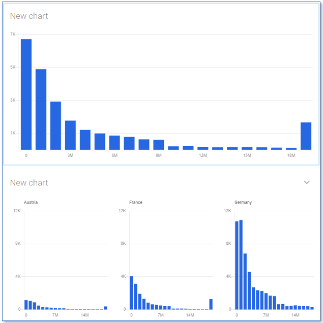
Distribution charts can be used to show the distribution of values of a numerical attribute.
Adding data to a distribution chart
In a distribution chart you select the that attribute for which you want to display values on the X-axis. The Y-axis is used to display the variable values defined by a metric. By default the metric displayed on the Y-axis is the record count. If you want to display a different value, you must create a metric to calculate the value and use the metric on the Y-axis by selecting it from the Metric drop-down list.
Follow these steps to add data to a distribution chart.
| Step | Action |
|---|---|
| 1 | Click on the chart to select it and go to the Chart tab. |
| 2 | Click on none next to X-axis and select an attribute from the table item list. Note: The attribute must be be a number, a currency or a date, it cannot be a text value. |
| 3 | Create a new metric in the table item list. |
| 4 | Click on none next to Metric and select a metric from the drop-down item list. Note: The Metric drop-down list only displays metrics and selectors that are defined in the table. |
See illustration below for an example distribution chart.

Splitting the chart
You can split the data on the distribution chart by adding columns and rows. Select an attribute from the Column drop-down list in the Grid panel to split up the data by the selected attribute and display the information in different distribution charts. You can add an additional dimension by selecting an attribute from the Row drop-down list to split the graph vertically in different rows.