- Before you begin
- Managing access
- Getting started
- Integrations
- Working with process apps
- Working with dashboards and charts
- Working with process graphs
- Working with Discover process models and Import BPMN models
- Showing or hiding the menu
- Context information
- Export
- Filters
- Sending automation ideas to UiPath® Automation Hub
- Tags
- Due dates
- Compare
- Conformance checking
- Process simulation
- Root cause analysis (Preview)
- Simulating automation potential
- Starting a Task Mining project from Process Mining
- Triggering an automation from a process app
- Viewing Process data
- Process Insights (preview)
- Creating apps
- Loading data
- Transforming data
- Autopilot™ for SQL (preview)
- Structure of transformations
- Tips for writing SQL
- Exporting and importing transformations
- Viewing the data run logs
- Merging event logs
- Configuring Tags
- Configuring Due dates
- Configuring fields for Automation potential
- Activity Configuration: Defining activity order
- Making the transformations available in dashboards
- Data models
- Adding and editing processes
- Customizing dashboards
- Publishing process apps
- App templates
- Notifications
- Additional resources

Process Mining user guide
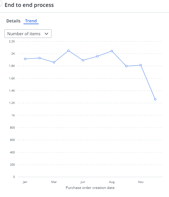
Line charts
Introduction
Line charts can be used to split data over different periods to show trends over time. The following illustration shows an example of a line chart.
In a line chart you select the field for which you want to display values on the X-axis. The Y-axis is used to display the variable values. By default the metric displayed on the Y-axis is the record count. If you want to display a different value, you can choose a different metric.
Properties
You can edit the properties of a line chart in the Edit line chart panel.
The following table describes the properties of the Line chart.
| Element | Description |
|---|---|
| Title | Text box that enables you to edit the title of the line chart. |
| Tooltip | Text box that enables you add a text that will be displayed as tooltip when the user hovers the mouse over the chart title in the published process app. |
| Field shown on the x-axis | Combo box that enables you to select the field for which you want to display the values on the X-axis. Note: You can select the new Timeframe filter as a field for the x-axis of a line chart or a KPI chart. When a business user selects a different timeframe the x-axis on the chart will change accordingly. |
| Metrics | List of metrics selected to be displayed on the Y-axis of the line chart.
Note: You must at least select one metric for the line chart. If you select multiple metrics, the first metric will be displayed on the Y-axis by default. |